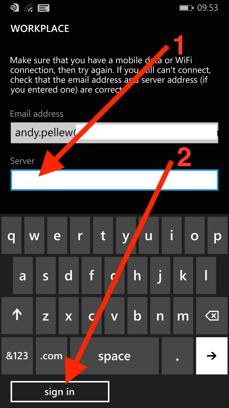
Here are a few select screenshots from that post;


The first three are from the OS (configuring a workplace account), the final one is from the Mobile@Work app from MobileIron. The issue I'd like to highlight is the positioning and appearance of the button.
Here you'll notice a few things;
- The button moves around. Sometimes it's under the displayed fields (first and third screens), sometimes it's at the bottom under the keyboard (second screen)
- It's consistently lowercase (add account, sign in) - when it's text
- In the second screen it's incorrectly labelled (sign in) - which it can't possibly do without a password. Perhaps it should be "next"?
- If it's text then it's consistently left-aligned
- On the third screen it's a tick, rather than text, and it's centered rather than left-aligned
There also seems to be a font issue;
- On screen two "workplace" (first and third screens) has turned into "WORKPLACE" - I'm guessing this is just a heading format issue (SETTINGS on the first screen seems to be the same header level)
- On the third screen "workplace" is lowercase next to an icon. This icon doesn't seem to ever get used again and "Icon + Name" on the All Applications screen suggests it should be Workplace not workplace
Here are another couple looking within the Settings app at Email Accounts and VPN configurations;
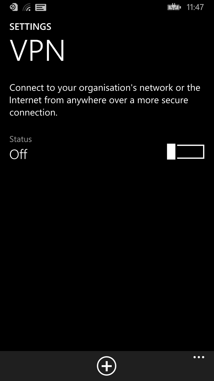

Here are a few things I notice about this;
- On the left (VPN) you can see a "+" button at the bottom of the app, whereas on the right the "+" button is near the top with a suffix "add an account"
- Should it be "VPN" or "vpn"? This is the typical problem of picking "lowercase" as your desired standard - you force people to do the exact opposite for things like VPN (capitals), Microsoft (init cap), WiFi (mixed), etc. This is also why most user interface designers compromise on "Init Caps" (i.e. capitalise the First Letter Of Each Word) and just allow things like VPN etc. to be exceptions
- "and" has been replaced by "+"
- The "add an account" link on the second screen. The header reads "email+accounts", but you can only "add an account"
So what's the point of all this? It's inconsistent. So what? It's not like it affects the capabilities of the device is it?
Well that's all true. I certainly didn't have any problems configuring the device however what I believe it shows is the lack of a single unifying goal behind the design. It's easy (and a little obvious) to say Microsoft is missing a "Steve Jobs"-figure but that's not really the issue. It should (and demonstrably is) possible to apply a consistent vision across a piece of software - lots of companies have done it including Microsoft. Remember when the "Office Ribbon" appeared? It wasn't as if the Excel or Outlook teams could have gone a different way.
The advantage of consistency (and this is an odd thing to have to say) is that everything looks the same. It means it's either the "best" design or it's not - everyone moves on to the next design or everyone stays where they are. You can't get an Office Ribbon in Outlook and old-style menus in Excel. What you need to make this work is a fairly flexible standard - there's no point in everyone agreeing to do something that doesn't work in all situations. Found a new situation? Agree it with the team responsible for the guidelines and move on. Someone else found a better way of doing something? Update the design and mark every app using the old design as needing an update. A lot of work I know, but what's the goal? Get the product out the door or make the best product possible?
This level of planning isn't impossible but it does require a great deal of organisational power to get it in place, and not too much power so that people feel they "own" the shared design rather than feeling the design is being dictated from somewhere else.
It's difficult to do, and the good news is that until Microsoft does something their interface will work, but will still appear a little unloved and uncared for. It's not just about passion for a good design - you also need the power to shape the product.
Maybe Windows Phone 10 will address the consistency issue ...