Pages

Sunday, September 6, 2015

Minecraft Birthday Invite (slightly off topic!)

My daughter want's a Minecraft party for her 7th Birthday and I put together this birthday party invite. I used Pages (for the Mac) but I've included a few links below which should allow you to edit the document for your own use).

The primary school my daughter attends allows them to have a "birthday table" at lunchtime on their birthday. I'll be there as well as a number of her friends.

Here are some links (all via Google Docs);
  • PDF (should you need it)
  • Pages (the raw file)
  • Word (just in case you're running Windows)

This was pretty easy to put together (largely thanks to Google Image Search).

 I'll be doing something similar for her main birthday party.

Monday, August 31, 2015

Deploying Carrier-Specific APN Settings using MobileIron

The first step is go into the policies and settings page in MobileIron. You'll need to login as an administrator and then go to the "Policies and Configs" tab and then into "Configurations";


Choose "Add New", then "iOS and OS X" and finally "APN". This will bring up the APN properties dialog to allow you to enter the APN details from the carrier;


We've added two APN's; one for Three and the other for Orange (both in the UK).

We primarily use AD groups to control who gets what but during a migration from one carrier to another this has not worked well. In the UK the switchover can happen anytime and the last thing you want is users to suddenly find themselves unable to access the network.

In order to fix this we've added some additional criteria to the label in MobileIron to ensure that users will only pickup the APN settings if they are on the right network.

The existing label criteria was;
"user.ldap.groups.name" =  "MobileIron_UK_APN"
We would simply put the user in the AD group they would pickup the APN information from our active provider.

This was changed to;
"user.ldap.groups.name" =  "MobileIron_UK_APN"  AND
"common.home_operator_name" =  "Three" AND "common.home_country_name" =  "United Kingdom"
In this way when users swap their sims and are migrated from the label should trigger the removal of the old APN even if the user is in the AD group which should be deploying it.

Similarly we create a another group to work in the other direction - to only apply the new APN for Orange if the user is in the right group AND on the Orange network (in the UK).

This actually had the happy side effect that users who were on Vodafone, O2, or any of the other virtual operators didn't pick up the APN if they'd be left in the group accidentally (or had two devices, one company the other private).

In this way we ensure disruption to the users (not to mention calls to ServiceDesk!) are minimised.

Thursday, August 27, 2015

Outlook 2016 (for Mac) Email Formatting/ Image Display Issue

I've been working today on an interesting issue with email formatting when you send HTML emails between the Mac and PC versions of Outlook. The issue only seems to occur one way - from Outlook 2016 on a Mac to Outlook 2013 on a Windows machine. In addition to font issues it also seems to be doing something "weird" with a PNG image I've embedded as a test.

So here's the problem. On the left is the test signature in Outlook 2016 (Mac) and on the right is the signature as it appears when it arrives in Outlook 2013 (PC);


As you can see the image shows that when the email arrives in Outlook 2013 the colour of the image changes (although if you save the file and open it in preview it is actually still the same colour - it's the way it's rendered that's different, not the image itself).

Clicking "reply" (which lets you see the font information being used) shows that while the email signature was build using the font Calibri (which is installed on both devices) it's being rendered in Outlook using "Times New Roman".

From what I can see (i.e. "thank you google") it looks like Outlook 2016 isn't including font information in the email so Outlook 2013 is reverting to it's standard font. The problem seems to persist if rather than using Outlook 2013 on a PC you use the mail client on an iPhone - this suggests Outlook 2016 is doing some odd rather than 2013 just not displaying it correctly.

What's going on with the image is a mystery! Which slightly deepens if you copy/ paste your email signature into Mail on the Mac. You still get the image problem, but not the font problem. However if you save the image to disk from the Outlook signature, open in preview, and then copy/paste into the email signature in Mail from there you don't get the same issue. Again the light image is also visible on an iPhone which suggests it's the information in the email message being rendered that is causing the issue.


Neither issue occurs if you use Apple Mail on a Mac, it's something specifically done by the latest version of Outlook.

Should I work out how to address this I'll make another post, just thought this was odd enough to justify a specific post ...

Monday, March 9, 2015

PL/SQL: Dropping a connected user

Here's a quick script I wrote to disconnect and then drop a connected user.

Just replace with the user you want to remove.

BEGIN
  FOR sql_command IN (select 'alter system kill session ''' || sid || ',' || serial# || '''' AS command FROM v$session WHERE username = '') LOOP
    EXECUTE IMMEDIATE
      sql_command.command;
  END LOOP;
  
  EXECUTE IMMEDIATE
    'DROP USER  CASCADE';
  COMMIT;
END;

You could make a parameter fairly easily, but this patch of code met my immediate needs (there was an web front end that was continually trying to connect but I didn't want to shut it down, just drop and re-create the user).

Wednesday, February 11, 2015

Oracle PL/SQL: Give me record counts for all tables in a schema

This piece of SQL will output the row counts for every table in the current schema in a CSV format;

declare 
  i integer;
begin
  dbms_output.put_line('Table Name,Row Count,' || TO_CHAR(SYSDATE, 'DD-MON-YYYY HH24:MI:SS'));
  for v_table in (select ut.table_name from user_tables ut) loop
    execute immediate
      'select count(*) from ' || v_Table.Table_Name
      into i;
    dbms_output.put_line(v_Table.Table_Name || ',' || TO_CHAR(i));
  end loop;

end;

Very useful for doing before/ after migration comparisons.

Thursday, January 22, 2015

WIN8: User Interface Consistency

Doing the post a few days ago in relation to configuring MobileIron on a Windows Phone 8.1 highlighted some inconsistencies in the user interface I thought it was worth highlighting with their own post - some I think are down to MobileIron but some are also Microsoft.

Here are a few select screenshots from that post;


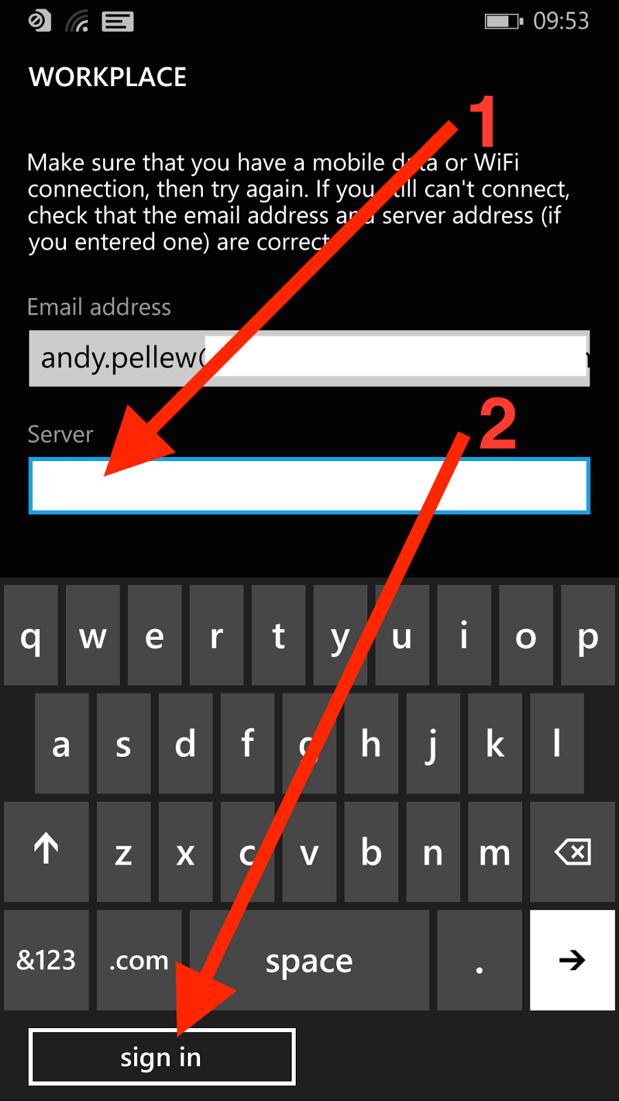
The first three are from the OS (configuring a workplace account), the final one is from the Mobile@Work app from MobileIron. The issue I'd like to highlight is the positioning and appearance of the button.

Here you'll notice a few things;

  • The button moves around. Sometimes it's under the displayed fields (first and third screens), sometimes it's at the bottom under the keyboard (second screen)
  • It's consistently lowercase (add account, sign in) - when it's text
  • In the second screen it's incorrectly labelled (sign in) - which it can't possibly do without a password. Perhaps it should be "next"?
  • If it's text then it's consistently left-aligned
  • On the third screen it's a tick, rather than text, and it's centered rather than left-aligned
There also seems to be a font issue;
  • On screen two "workplace" (first and third screens) has turned into "WORKPLACE" - I'm guessing this is just a heading format issue (SETTINGS on the first screen seems to be the same header level)
  • On the third screen "workplace" is lowercase next to an icon. This icon doesn't seem to ever get used again and "Icon + Name" on the All Applications screen suggests it should be Workplace not workplace

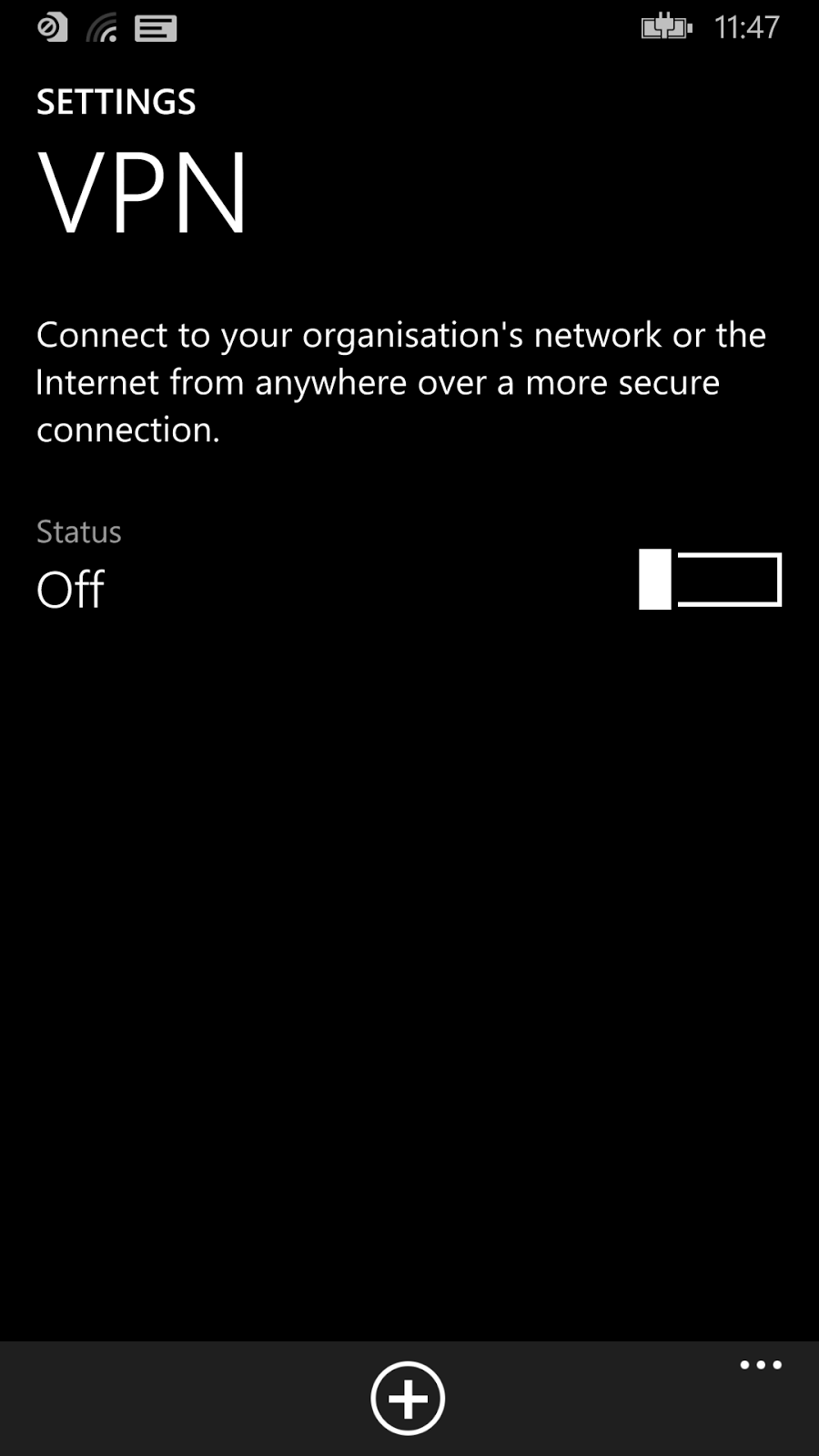
Here are another couple looking within the Settings app at Email Accounts and VPN configurations;


Here are a few things I notice about this;
  • On the left (VPN) you can see a "+" button at the bottom of the app, whereas on the right the "+" button is near the top with a suffix "add an account"
  • Should it be "VPN" or "vpn"? This is the typical problem of picking "lowercase" as your desired standard - you force people to do the exact opposite for things like VPN (capitals), Microsoft (init cap), WiFi (mixed), etc. This is also why most user interface designers compromise on "Init Caps" (i.e. capitalise the First Letter Of Each Word) and just allow things like VPN etc. to be exceptions
  • "and" has been replaced by "+"
  • The "add an account" link on the second screen. The header reads "email+accounts", but you can only "add an account"
So what's the point of all this? It's inconsistent. So what? It's not like it affects the capabilities of the device is it?

Well that's all true. I certainly didn't have any problems configuring the device however what I believe it shows is the lack of a single unifying goal behind the design. It's easy (and a little obvious) to say Microsoft is missing a "Steve Jobs"-figure but that's not really the issue. It should (and demonstrably is) possible to apply a consistent vision across a piece of software - lots of companies have done it including Microsoft. Remember when the "Office Ribbon" appeared? It wasn't as if the Excel or Outlook teams could have gone a different way.

The advantage of consistency (and this is an odd thing to have to say) is that everything looks the same. It means it's either the "best" design or it's not - everyone moves on to the next design or everyone stays where they are. You can't get an Office Ribbon in Outlook and old-style menus in Excel. What you need to make this work is a fairly flexible standard - there's no point in everyone agreeing to do something that doesn't work in all situations. Found a new situation? Agree it with the team responsible for the guidelines and move on. Someone else found a better way of doing something? Update the design and mark every app using the old design as needing an update. A lot of work I know, but what's the goal? Get the product out the door or make the best product possible?

This level of planning isn't impossible but it does require a great deal of organisational power to get it in place, and not too much power so that people feel they "own" the shared design rather than feeling the design is being dictated from somewhere else.

It's difficult to do, and the good news is that until Microsoft does something their interface will work, but will still appear a little unloved and uncared for. It's not just about passion for a good design - you also need the power to shape the product.

Maybe Windows Phone 10 will address the consistency issue ...


Wednesday, January 21, 2015

WIN8: Configuring A Workplace (MobileIron) Account on Windows Phone 8.1 (inc. Screenshots)

Here are a brief set of instructions (with lots of screen shots!) showing you how to configure a workplace account on Windows Phone 8.1. It might be slightly different for your configuration - I needed to enter a server address, it might be able to identify yours from your email - but should be good for everyone.

It isn't significantly different from Windows Phone 8.0, but is slightly different.

Start from the home screen;


Touch on the middle of the screen and pull your finger up (to move the screen down) to the very bottom;


The "All Applications" (or next) button will appear at the very bottom right of the screen. Touch here;


Touch any of the letters (C is highlighted, but it could be any letter);


We are after the "Settings" application so touch "s";


Touch "Settings";


Touch on the screen and pull upwards to scroll down. Unfortunately the list items aren't in Alphabetical order so stop when you see "workplace" appear;


Touch "workplace";


Touch "add account";


Touch on the "Email Address" box;


Enter your company email address (1) and then touch "sign in" at the bottom of the screen;


If Windows Phone can identify your server automatically it will just move on, if it can't a Server entry box will appear - touch it;


Enter the name of the Server (you don't need http or https, just something like my.server.com) (1) and then press "sign in";


As you can see here it's correctly identified that it's connected to a MobileIron server. Your email address should be populated from before, touch in the "Password" entry box to bring up the keyboard;


Enter your work password (1), and then touch "sign in" (2);


"We're looking for your settings ..." will appear at the top of the screen, a few seconds will pass and (providing all the details are correct and you're allowed to register new devices) you will see;


Make sure "Install company app" (1) is checked and then touch "done".

Go back to the main screen, back into All Applications (as shown at the start) but this time press "M" rather than "S";


Touch "Mobile@Work";


Touch on the "Email address" box and enter your email address (1) and password (2) and then touch the tick at the bottom the screen (3);


The "Server" box will appear (if it can't find it automatically), touch on the Server box (1), enter your server details exactly as you entered them when configuring the workplace account, and then touch the tick at the bottom (2);


Another few seconds will pass while the client updates from the server and then you will see your company apps;


That's it, you're done.